Industry : Transportation

NYC Yellow Taxi Dashboard

Analyze NYC Yellow Taxi trip volume, pickup and drop-off patterns, fares, and travel times to support data-driven urban mobility planning.

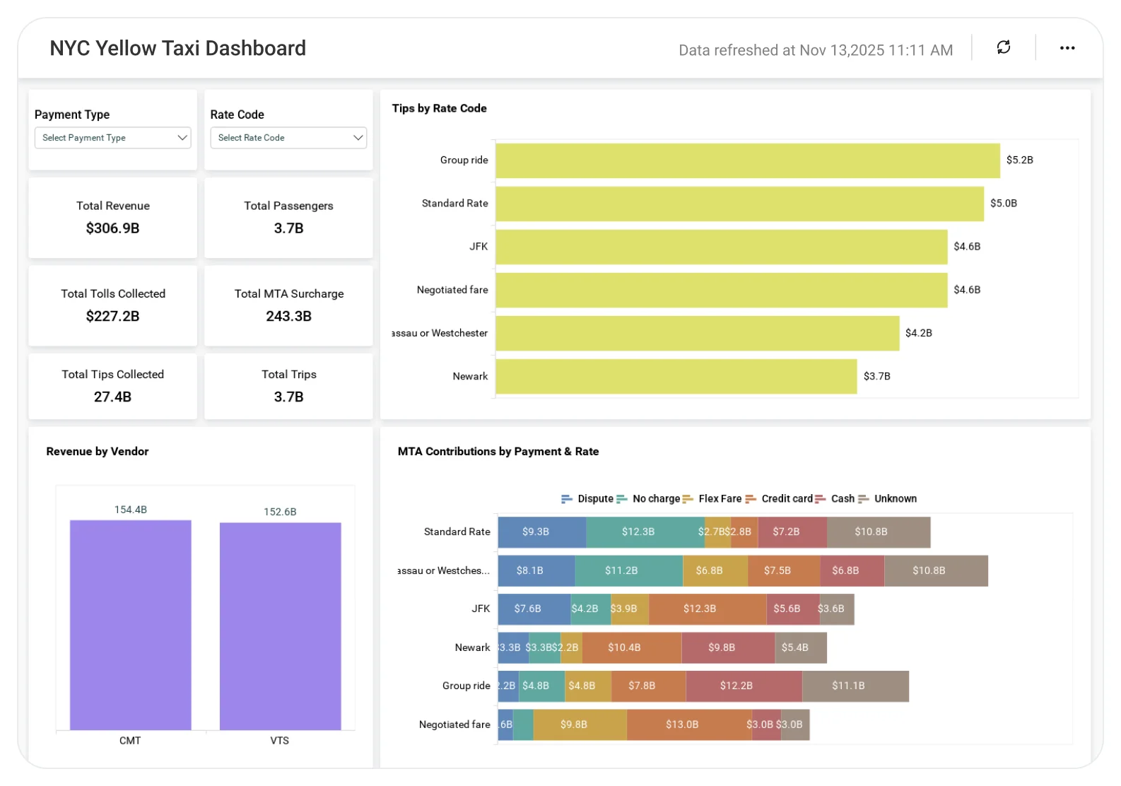
The NYC Yellow Taxi Dashboard helps transportation analysts and city planners track trip demand, fare patterns, and pickup and drop-off behavior across New York City, supporting congestion analysis and informed planning decisions.
TL;DR

  • Track overall taxi trip volume and demand trends to understand city-wide mobility patterns.
  • Identify pickup and drop-off hotspots across NYC to reveal high-demand zones and congestion areas.
  • Analyze fare, distance, and trip duration patterns to assess travel efficiency and pricing behavior.
  • Monitor time-based demand fluctuations by hour, day, or period to capture peak travel trends.
  • Support smarter transportation planning and urban mobility decisions with data-driven taxi insights.

What Is NYC Yellow Taxi Dashboard?

An NYC Yellow Taxi Dashboard is an analytics solution that helps teams analyze public taxi trip datasets to understand how taxi services operate across the city. 

In Bold BI, this dashboard consolidates NYC Yellow Taxi trip records to uncover travel trends, identify high-demand zones, and support data-driven transportation analysis and planning. 

Why NYC Yellow Taxi Dashboard Matters

Taxi data offers valuable insights into city movement, congestion, and travel behavior. 

When trip data is reviewed only through raw datasets: 

  • Demand patterns are hard to interpret.
  • Congestion hotspots remain unclear.
  • Fare and distance trends lack context.
  • Transportation planning relies on assumptions.

A centralized analytics dashboard enables teams to move from static datasets to actionable, insight-driven urban mobility analysis. 

What You’ll Track

Using Bold BI dashboards, you will track important KPIs such as:

  • Trip volume trends: Number of taxi trips over time to understand demand fluctuations.
  • Pickup & drop-off distribution: High-traffic locations across NYC to identify mobility hotspots.
  • Fare & revenue patterns: Fare amounts and payment types to analyze revenue behavior.
  • Trip distance & duration metrics: Travel distance and time to assess efficiency and congestion impact.

All dashboards are fully customizable, allowing you to add KPIs or metrics as needed.

How It Works

  • Connect NYC Yellow Taxi trip SQL, Excel datasets or REST APIs to Bold BI.
  • Apply the NYC Yellow Taxi Dashboard sample.
  • Combine trip, fare, time, and location data in one unified view.
  • Analyze insights by zone, time period, or trip attribute.
  • Share dashboards with planners, analysts, and decision-makers.

Why Bold BI Is the Right Fit for NYC Yellow Taxi Analytics

  • Unified mobility visibility: Bring trips, fares, and location data into a single analytics dashboard.
  • Centralized demand analysis: Evaluate trip patterns, hotspots, and time-based trends together.
  • Comparative insights: Compare demand across zones, periods, or payment types.
  • Actionable drilldowns: Explore specific routes, locations, or time windows in detail.
  • Flexible deployment: Deploy dashboards in cloud or self-hosted environments for research or planning needs.

Compare Options (at a glance)

Feature Bold BI Raw Datasets Spreadsheets
Taxi trip analytics  Yes Manual Manual
Pickup & drop-off hotspot analysis  Yes Limited Manual
Fare & distance insights  Yes Limited Manual
Time-based demand trends  Yes Limited No
Custom KPIs & drilldowns  Fully customizable Not available Manual

Frequently Asked Questions

Yes. Pickup and drop-off distribution views highlight areas with consistently high taxi demand across the city.
Absolutely. Trip and time-based insights support congestion analysis, infrastructure planning, and policy evaluation.
Yes. Fare metrics and payment type breakdowns help explain revenue patterns and rider preferences.
Yes. Hourly, daily, and seasonal views reveal demand fluctuations across different time periods.
Yes. The dashboard transforms raw datasets into interactive visuals, reducing manual data exploration.
Yes. The dashboard scales well for large public datasets and analytical use cases.

Compare Options (at a glance)

Feature Bold BI Raw Datasets Spreadsheets
Taxi trip analytics  Yes Manual Manual
Pickup & drop-off hotspot analysis  Yes Limited Manual
Fare & distance insights  Yes Limited Manual
Time-based demand trends  Yes Limited No
Custom KPIs & drilldowns  Fully customizable Not available Manual

Simple Pricing That Grows With You

Say goodbye to hidden costs, complex quotes, and pricing guesswork.

Clear ROI from Day One

No complicated quotes—just honest, value-driven pricing that delivers more for less, right from the start.

Built to Grow with You

From startup to scale-up, Bold BI grows with your business — no forced upgrades, just flexible, future-ready analytics.

Fits Every Budget

Whether you're a startup or an enterprise, our flexible pricing scales with your growth— Pay only for what you truly need.

Trusted & recognized

Analytics that wins awards and users.

Recognized by G2, TrustRadius and Visual Studio Magazine for delivering standout performance and value.

I appreciate Bold BI for making it easier to provide reporting for our customers, allowing both our analysts and customers to easily build and publish reports. The ability to build dashboards and modify queries for specific outcomes is very user-friendly. I value the mobile readiness of the app and its integration capabilities with API structures. The addition of AI features is impressive. The economic pricing model and the effective partnership, which includes consistent and helpful support, make it an invaluable tool for our OEM model.

Ravi S.

The support from Bold is unmatched. They do not charge extra for support and it is excellent anyway. All our tickets and questions are quickly answered with authoritative and precise guidance. This is important at the product is complex, powerful and mature. To get the most out of the tool, the level of support they provide is essential.

Murph M.

It was easy to implement data visualizations into our product. The standard widgets allowed us to build professional looking dashboards, and a robust API provided excellent control of the development and runtime process from within our application.

Scott Y.

RECOGNITION

Users Love Us

Visual Studio Reader's Choice - 2025

Leader - Fall 2025

High Performer - Fall 2025 EMEA

Regional Leader - Fall 2025 AMERICAS

TrustRadius Tech Cares

Capterra - 4.9/5

G2- 4.3/5

GetApp - 4.9/5

Software Advice - 4.4/5

Frequently Asked Questions

Yes. Pickup and drop-off distribution views highlight areas with consistently high taxi demand across the city.
Absolutely. Trip and time-based insights support congestion analysis, infrastructure planning, and policy evaluation.
Yes. Fare metrics and payment type breakdowns help explain revenue patterns and rider preferences.
Yes. Hourly, daily, and seasonal views reveal demand fluctuations across different time periods.
Yes. The dashboard transforms raw datasets into interactive visuals, reducing manual data exploration.
Yes. The dashboard scales well for large public datasets and analytical use cases.
Ready to Get Started?

Start your 30-day free trial instantly

Easy integration, AI-Powered Dashboards and 24x5 real-time support.